Application Flows - Flows map
The flows map is a dynamic and interactive chord diagram of the flows.
You can toggle between this view and the Detailed flows list with the ![]() /
/ ![]() button.
Both views are different representations of the same data, with the same filters
applied.
button.
Both views are different representations of the same data, with the same filters
applied.
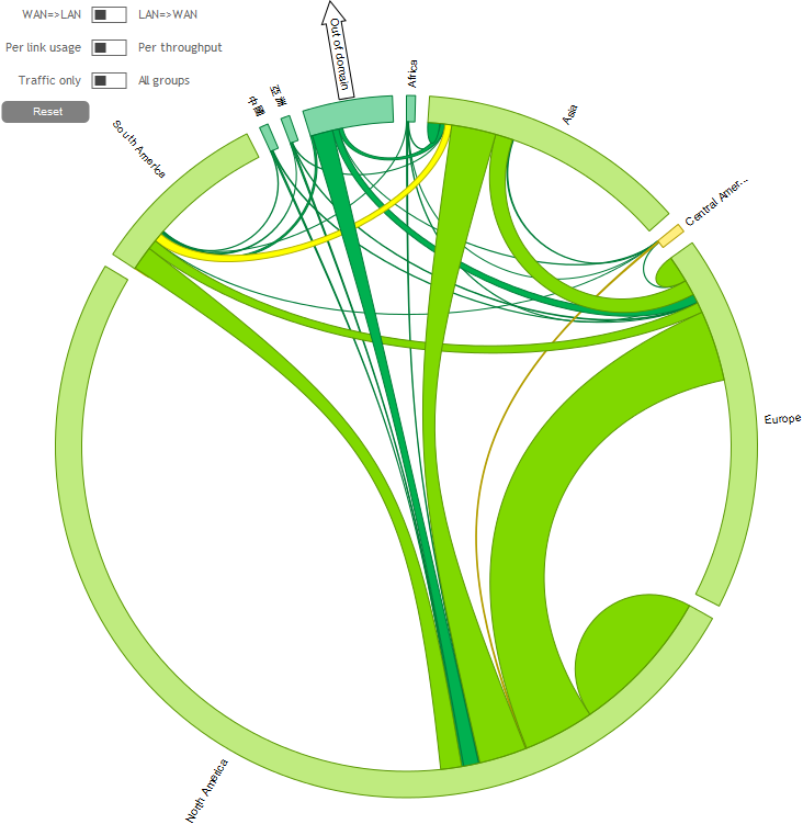
It displays the flows matrix with a hierarchical structure:
| 1 | Folders (e.g. continents*), |
| 2 | Subfolders (e.g. countries*), |
| 3 | Sites (e.g. called by the name of the cities), |
| 4 | NAPs (if the Site has several NAPs, when Dynamic WAN Selection is used). |
* Folders and Subfolders are defined in the Appliances creation window. For instance (as in the example above), they can be used to sort the Sites continent by continent (Folders = continents), then country by country (Subfolders = countries).
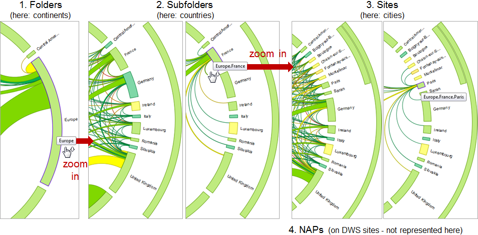
You can zoom in and zoom out these four levels:
| • | zoom in by clicking on the arcs or on their names (in the example below:
Europe > France > Paris); the cursor shows a down arrow: |
| • | zoom out by clicking on the external arcs; the cursor shows an up arrow: |
Zooming in the flows map:
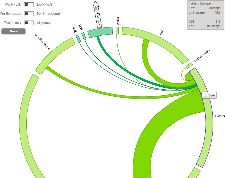
Hovering the mouse on any arc (without clicking down) shows the flows between that arc and the others only (instead of the whole matrix between all pairs of arcs) (see below).
The colors of the flows and their extremities indicate the quality (between green (EQS = 10) and red (EQS = 0)). The color is strong for the flows, pale for the extremities. The exact EQS of both the flows and their extremities can be displayed by hovering the mouse on these objects.
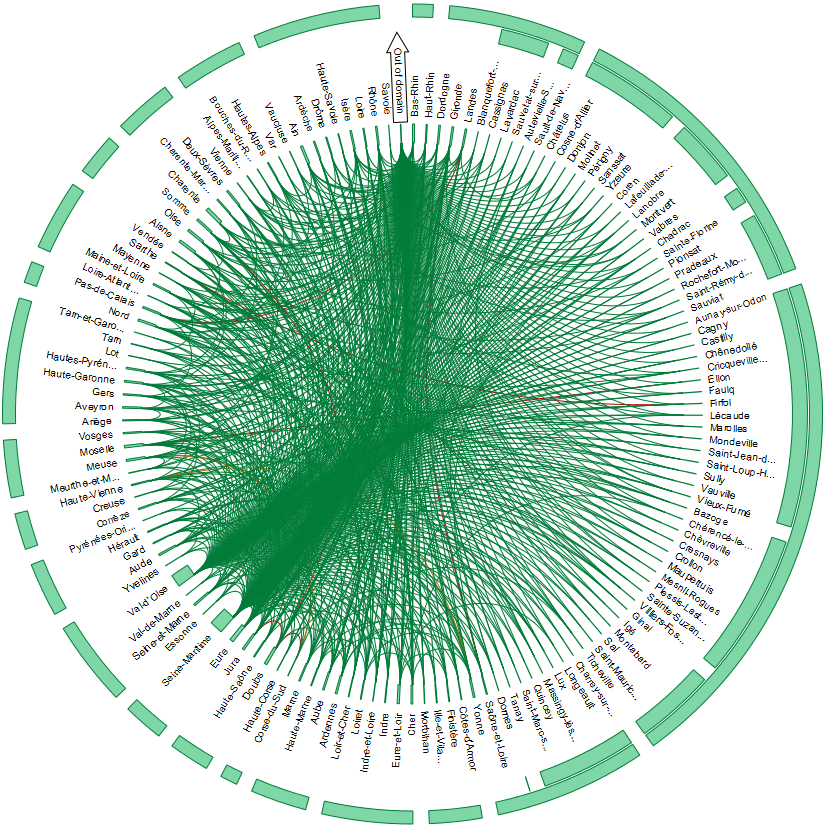
There is a maximum number of flows that can be displayed simultaneously (a diagram showing thousands of flows would be unreadable anyway, so it would be completely useless). If this maximum number is exceeded, the map is replaced by a message telling you that there are too many groups to display, and that you should refine your filter: use the filters to concentrate on the flows you want to see.
Flows map with too much zoom and too many chords displayed:
When the map is opened, it shows the Folders level (e.g. the flows between continents). Out of Domain is displayed on its own, indicated by an arrow.
Hovering the mouse on an extremity hides the traffic between the other extremities and displays this extremity's details (volume and quality) in a pop-up. Here for instance, you can see the traffic between Asia and the rest of the world.
Flows map, showing the traffic flows of one extremity:
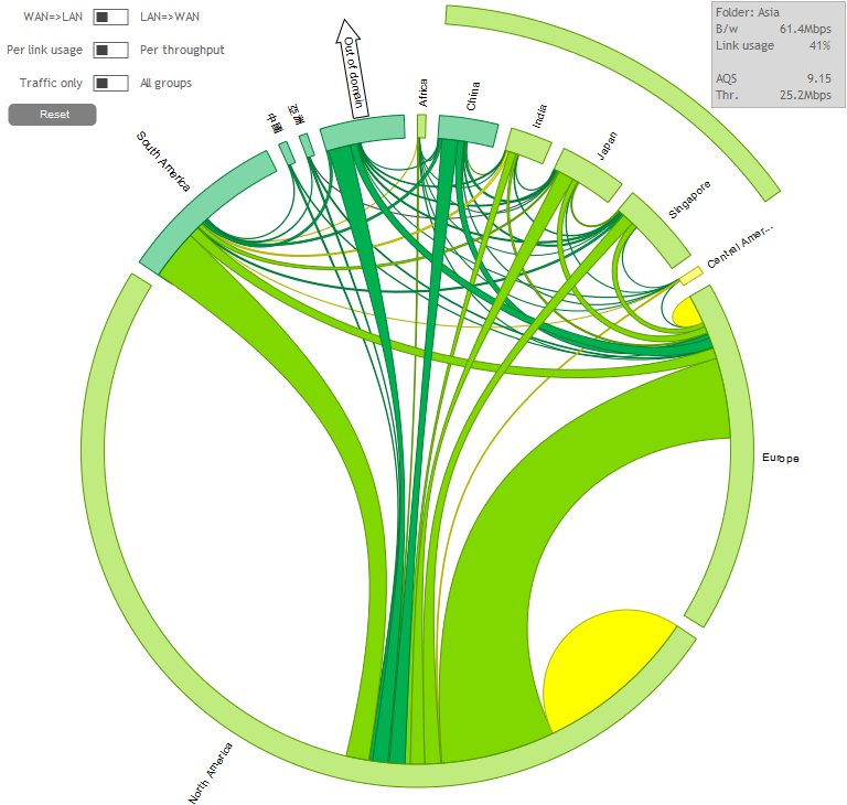
Clicking on an extremity or on its name (e.g. Asia) allows zooming in this extremity (e.g. continent), breaking it up into the next level (here: countries). Here for instance, we are zooming into Asia to see the traffic between each Asian country and the rest of the world (still displayed as continents).
Flows map, zooming from a continent (folder) into its countries (subfolders):
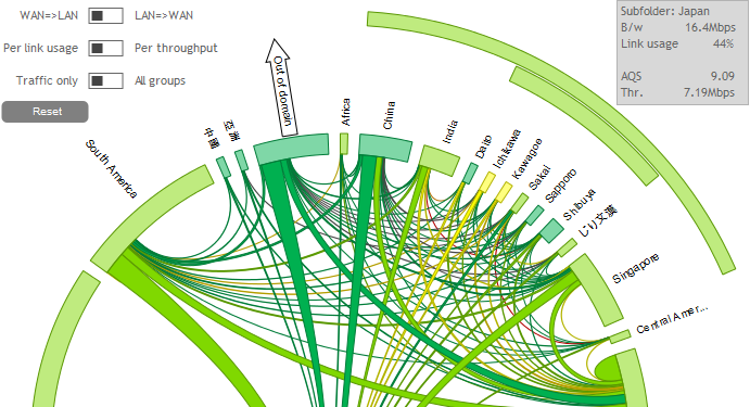
It is possible to zoom in again, from a country (subfolder) to its Sites.
Flows map, zooming from country (subfolder) to its Sites:
... and from a Site to its NAPs (when there are several NAPs on the Site).
Use the Reset button to reset the view.
The three switches at the top left of the diagram allow changing some display settings: LAN=>WAN / WAN=> LAN, Per link usage / Per throughput and Traffic only / All groups.
By default, the three switches are in the LAN=>WAN, Per link usage and Traffic only positions:
Flows map, with the three switches in their default positions
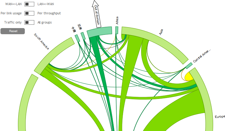
| • | The [LAN=>WAN / WAN=> LAN] switch allows changing the direction of the displayed flows. |
| • | [Per link usage / Per throughput] allows showing traffic chords with a size proportional to: |
| • | the links (Per link usage); arc = available bandwidth; chords = traffic; in the example above, you can see that in South America, about a third of the bandwidth is used (you can read the exact percentage by hovering the mouse on the arcs); |
| • | the throughput (Per throughput); arc = sum of the chords = total traffic: the traffic is displayed independently of the available bandwidth. |
Flows map, displaying the link usage (Per link usage):
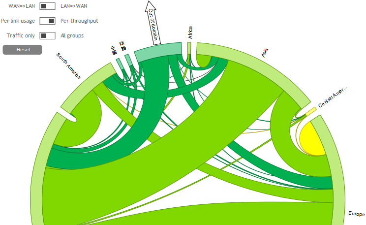
| • | [Traffic only / All groups] allows displaying extremities with traffic matching the filters only (Traffic only) or all the groups where traffic is also present (but without matching the selected filters). |
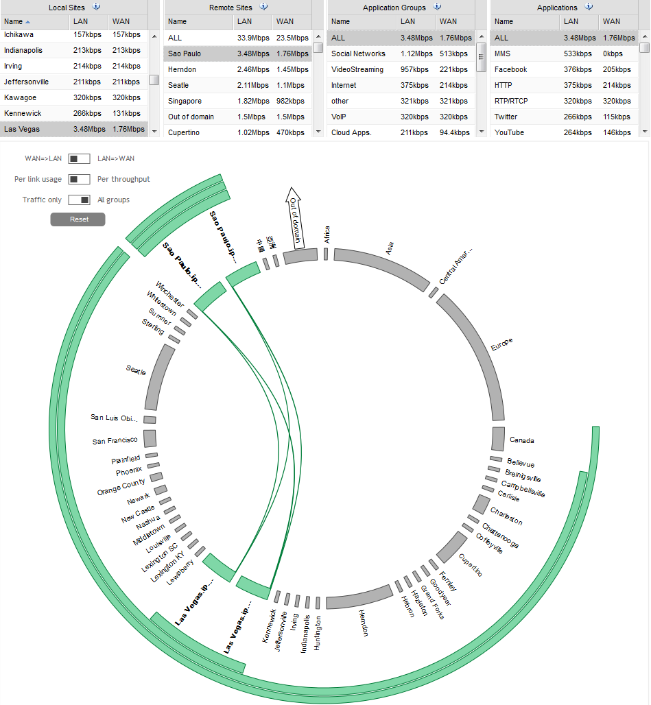
The three switches can be combined to display the desired information. Here for instance, you want to see the traffic from Las Vegas to Sao Paulo (LAN=>WAN) as a proportion of the links on these Sites (Per link usage), showing the other links as well (All groups), so that you can see what the traffic from Las Vegas to Sao Paulo represents.
Flows map, displaying the link usage between two Sites, on the whole Domain:
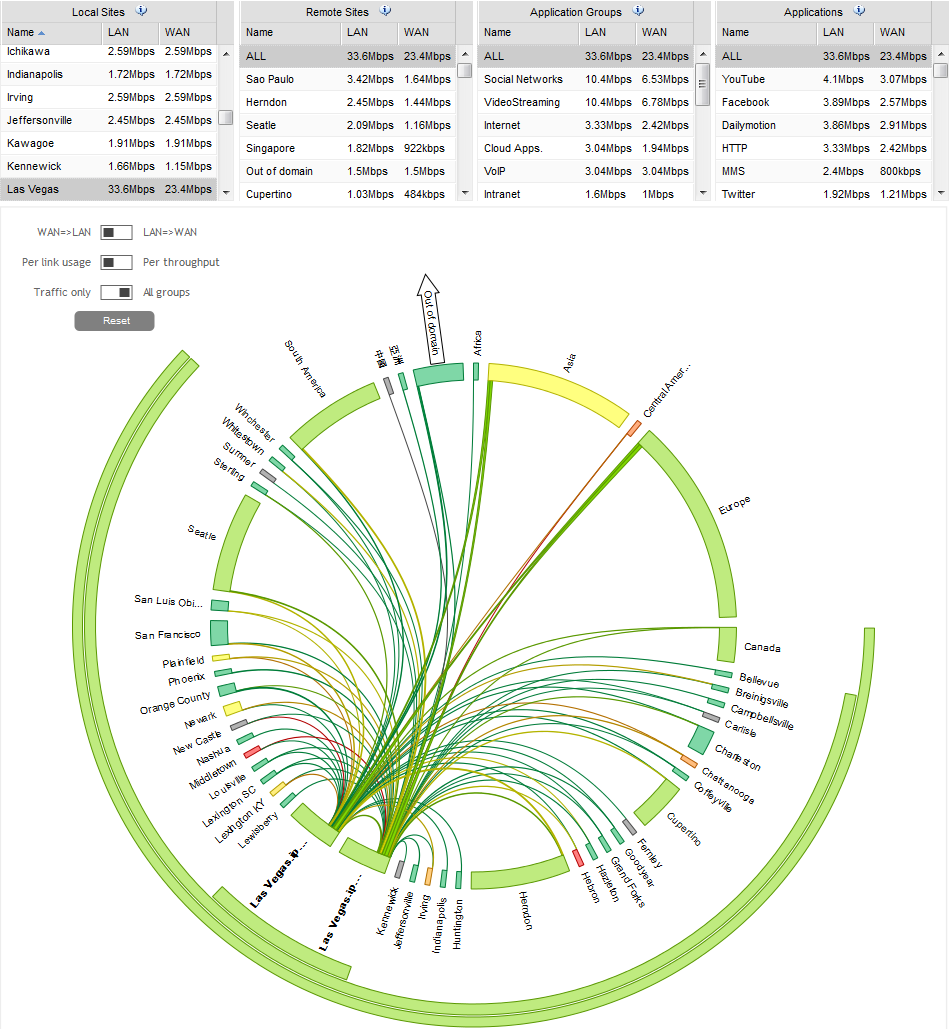
By removing the Remote Sites filter, you can now see, on the same diagram, the traffic from Las Vegas to all the remote sites (with the one between Las Vegas and Sao Paulo highlighted).
Flows map, displaying the link usage between a Site and all the remote ones:
At any level of the map, clicking on a chord opens the flows list, automatically filtered out to display the flows corresponding to the selected chord.
Exporting the maps
When right-clicking the map, a contextual menu enables you to export it, either as a graph (PNG format) or as raw data (CSV format):
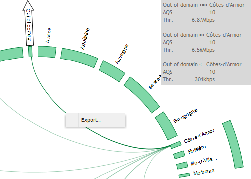
The frame that opens has two tabs:
| • | Chart, allowing to download the map as a PNG image: |
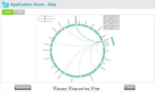
Three check boxes allow displaying or hiding the Borders, the Date and Time and the Title.
| • | Data, allowing to download the map as CSV data: |
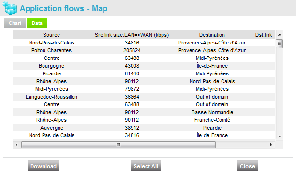
In either case, use the ![]() button to download the data.
button to download the data.